
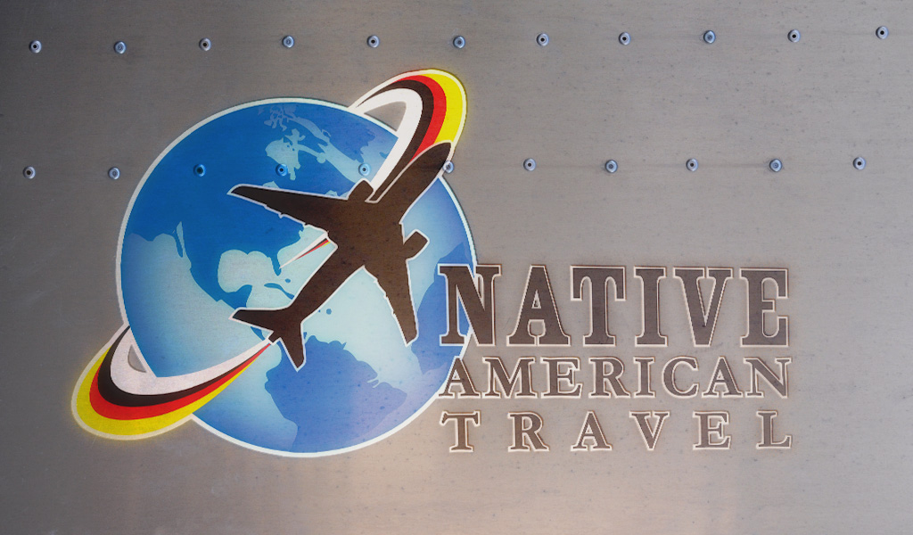
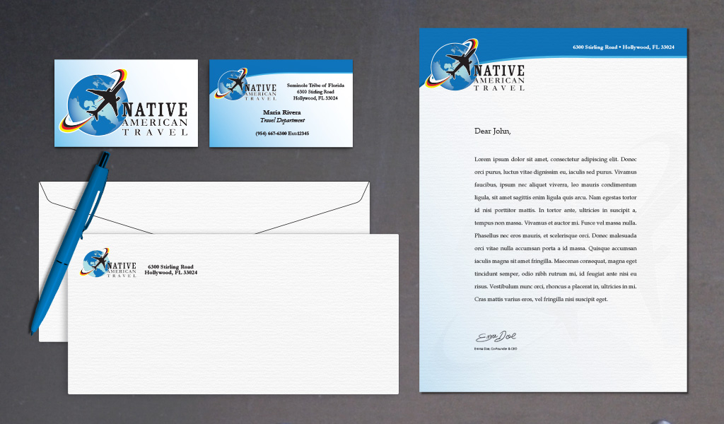
Native American Travel is a fully accredited travel agency established in 2009 and owned by the Seminole Tribe of Florida. I created a logo that reflected the movement of travel, integrating the traditional ‘medicine colors’ of white, black, yellow and red.
A great brand consistency was achieved throughout their stationery package through the use of colors and placement of the logo. The design is traditional, with a clean, minimal feel. This was a really fun project to work on!
The STEP program was developed as part of the Ah-Tah-Thi-Ki Museum’s commitment to sharing knowledge about the Seminole life and culture. They provide other institutions with quality traveling exhibitions.
This logo design is among my favorites – I love the combination of brush script with the clean sans serif font, reflecting the rich heritage juxtaposed with the modern institutions borrowing these exhibitions. The STEP letters are also arranged in such a way as to resemble steps.
I was approached by my friend and early childhoold specialist Enery Lopez to create a whimsical logo for her non-profit organization, ¡Ju! Inc which promotes children-led play in repurposed urban spaces. I’ve also had the pleasure of creating the flyers for most of their pop-up playground events.
As part of the organization’s continued brand development, I created the graphics and animations for their presentation at the 2014 World Forum on Early Care and Education. In attendance were 841 early childhood professionals from 81 nations.
Ms. Lopez was a keynote speaker for the Promoting Play in the Community panel, sharing Ju’s innovative ideas and approach.
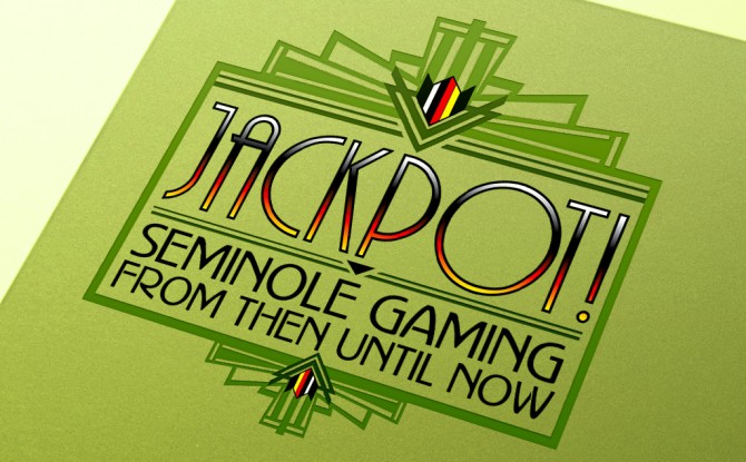
Jackpot! first debuted at the Ah-Tah-Thi-Ki Museum at Okalee in October 2007. I created the art-deco logo, panel design and timeline illustrations for the 6 pop-up banners, as well as an exhibition brochure, and other print advertisements for this traveling exhibit.
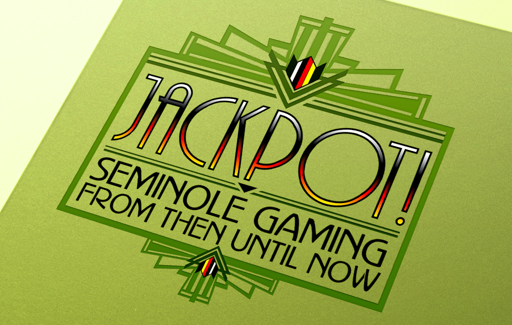
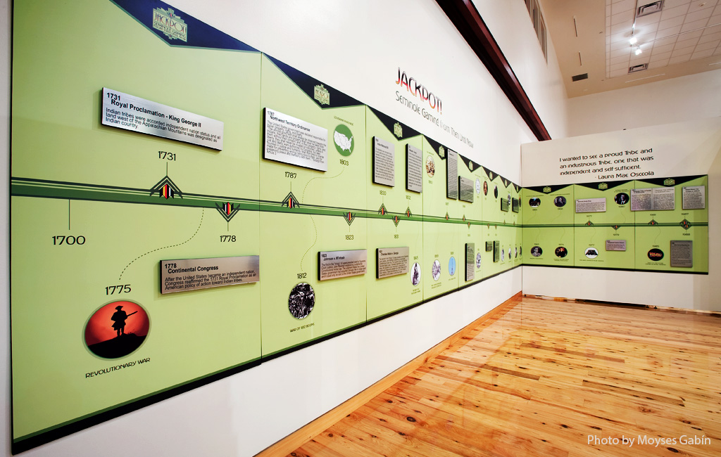
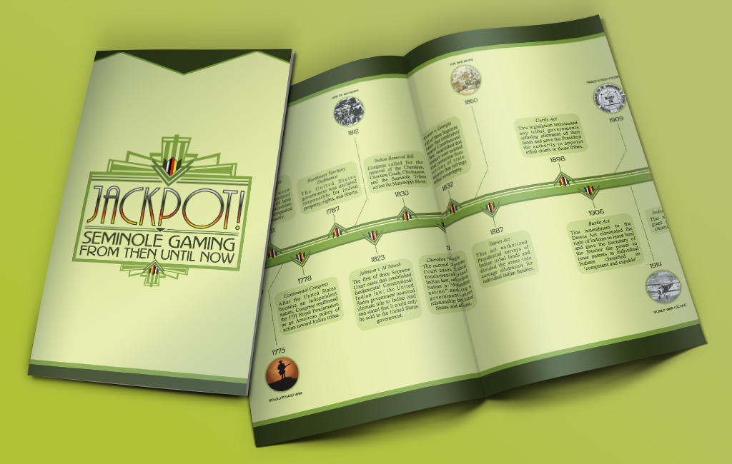
This was one of my favorite projects I’ve ever worked on. It focuses on the history of Seminole Gaming, from its beginnings to the vast and prestigious operation it is today, particularly after their historic acquisition of the Hard Rock Cafe, hotel and casino business.
I created a sketchy, hand-drawn logo treatment for the Association of Latin American Students and Teachers College, Columbia University’s 9th Annual Education Across the Americas Conference. The logo was used for gift tote bags, as well as the posters, flyers and the program booklet.
This two-day conference invited members of different learning and scholarly communities from Latin America, the Caribbean, and North America, to share their experiences and knowledge on the promotion of educational development and educational change across the Americas.
This was a minimalist, yet bold typographic design for the Unconquered Imagination art exhibit. It featured contemporary native artists from across the country and ran at the Hollywood Ah-Tah-Thi-Ki Museum through October 2009. It takes its name from The Unconquered Seminole Tribe of Florida, who through political, military, and psychic resistance has persevered as a sovereign people in the face of devastating change.
The Seminole Tribe of Florida now dictates the terms of its engagement with contemporary America, and the Ah-Tah-Thi-Ki museum is one product of this long history of resistance and imagination.
The Jason Taylor Foundation wanted a simple, yet elegant logo for their famous charity golf tournament. A minimalistic design complements the use of script and serif fonts.
Celebrating its 11th year, the event benefits Jason Taylor’s foundation, an organization whose mission is to support and create programs that facilitate the personal growth and empowerment of South Florida’s children in need. It also benefits the Holtz Children’s Hospital and Take Stock in Children.
I love working on projects like these – great causes always move me. I created a simple illustration of a teenager reading (with the ever-present earburds!) paired with a clean, youth-feeling font.
The Jason Taylor Reading Room is an after-school program designed to address academic challenges among inner-city youth, particularly in the areas of literacy. It is provided at no cost to underserved middle and high school students.

